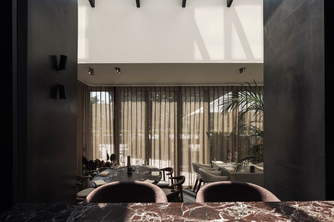
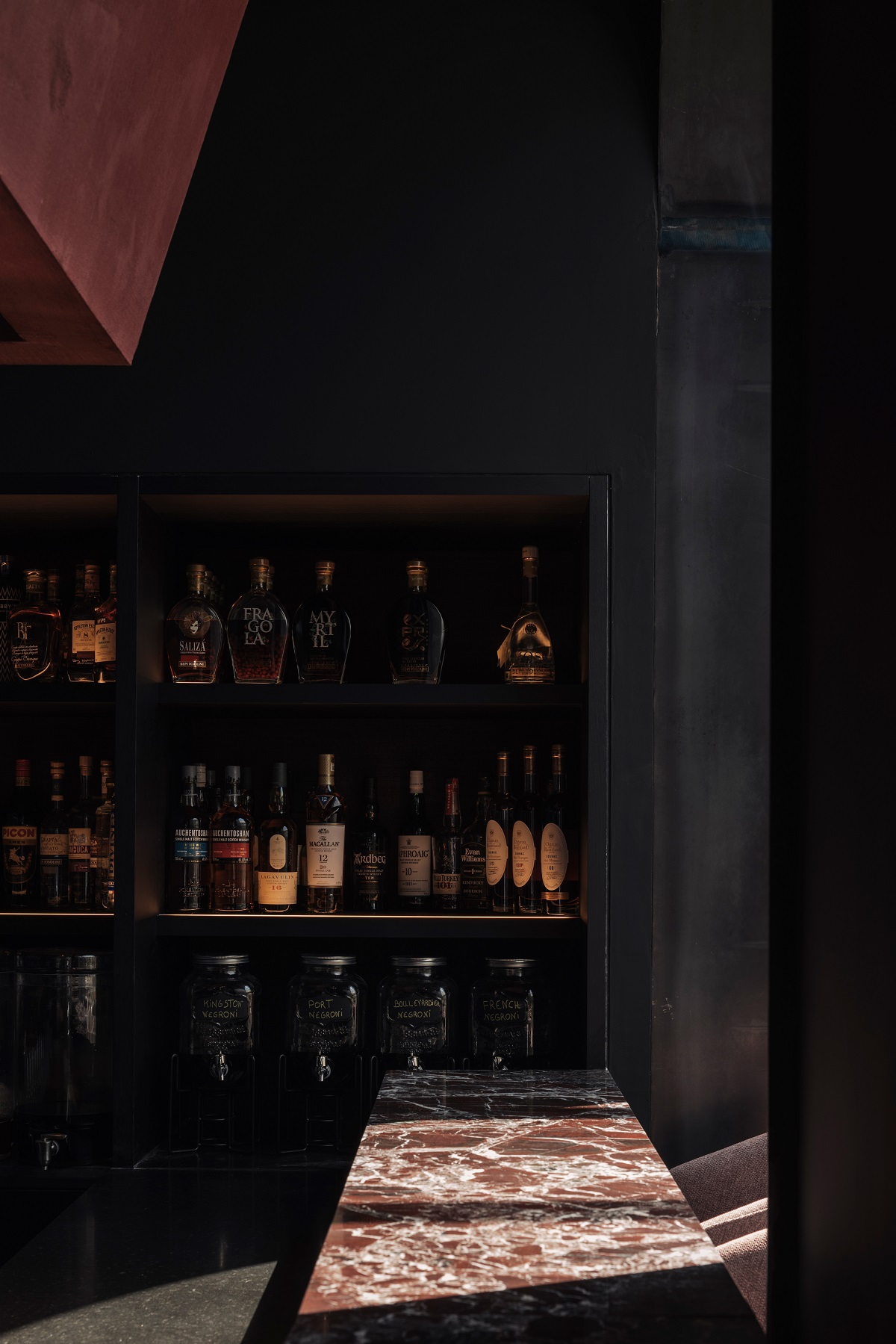
Portinari, the city of Bruges and its well-known painters, such as Hans Memling who painted a portrait of Tomasso Portinari, were the inspiration behind WeWantMore’s design for Cult, envisioned as a design response to the ever-changing restaurant landscape in the city. The result is a dramatic setting with an intense play of chiaroscuro: strong natural light that contrasts with a dark interior enriched by interesting textures. The veranda is light and intimate, and the bar in the back adds drama.
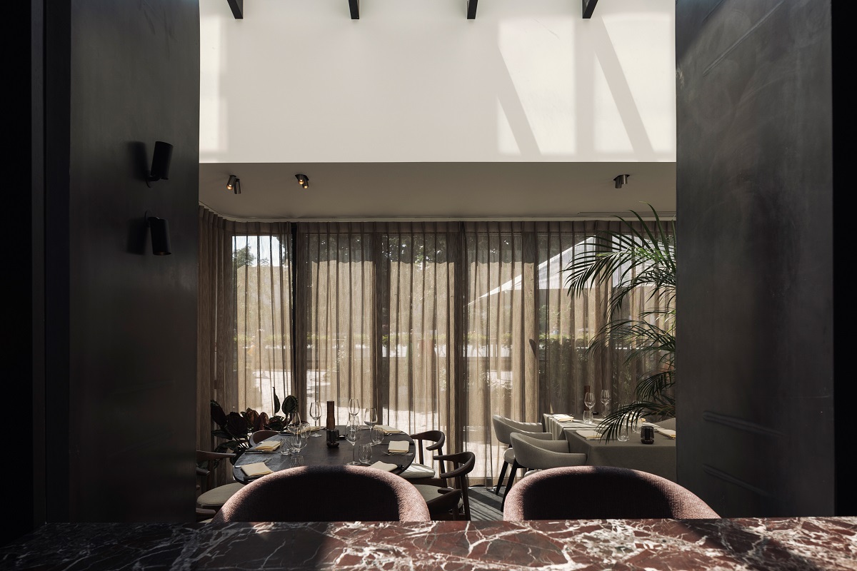

Image credit: WeWantMore
Launched by renowned sommeliers Luk De Rooze and Kees Dobbelaar, Cult brings their love of wine and grilled meat to a new concept and location.
“When Luk and Kees approached us to design Cult, we wanted to create something people would remember and want to come back to again and again,” says Nancy Cool, Interiors Design Director at WeWantMore. “The design teams – both on the interior design side and the branding side – wanted to create a space with high drama that was also restrained in a very Belgian way.”
- Image credit: WeWantMore
- Image credit: WeWantMore
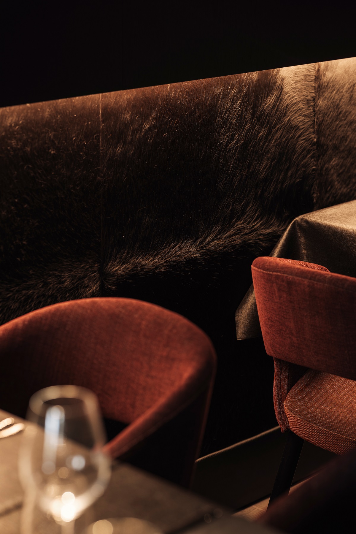
In the bar, a burgundy red volume above the bar sets the scene. The bar itself is a proof-point of luxury with dark veneer, velvet fabrics and leather detailing. The marble countertop has dark red veins, referencing the meat dishes served in the restaurant. Subtly lit wall panelling upholstered in tactile cow hide offset wine-coloured sofas.
Through arched doorways cleverly clad in reflective steel, the veranda is dedicated to diners and flooded with natural light. The play of light continues with a steel-clad waiters’ station that cuts the space in two.
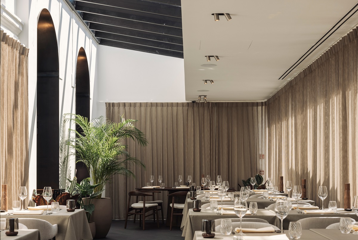

Image credit: WeWantMore
As well as the interior, WeWantMore was responsible for the branding of Cult. Sharp colour contrasts, moody lighting and the play of red tones dominate the photography. The logo is created with sharp lines as though it was cut by the ultrasharp cooks’ knives. The typography chosen is LL Bradford offering a wide variety for informal but also very serious usage.
